43.6% of marketers build landing pages specifically to generate leads. Most of them struggle to convert because the page structure, messaging and flow were not thought through before the design started.
The best landing pages are built for one job: turning a click into a customer. Our team breaks down the anatomy, types and best practices behind landing page design that actually converts.
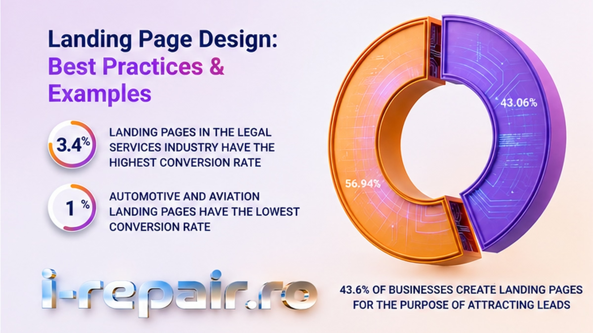
43.6% of marketers build landing pages specifically to generate leads. Most of them struggle to convert because the page structure, messaging and flow were not thought through before the design started.
Effective landing page design is purpose-built around a single conversion goal. Unlike a full website, it strips away navigation menus, competing links and secondary content to keep the visitor focused on one action: filling out a form, booking a call or making a purchase. With conversion rates varying widely by industry, the design of the page makes all the difference.
According to a report from First Page Sage, Legal Services landing pages convert the most, at 3.4%, while Automotive and Aviation convert the least, at just 1.0%.
The core conversion levers come down to four things:
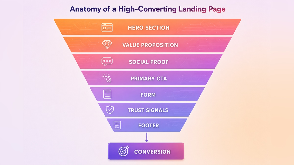
Every element of a landing page design should earn its place in the conversion funnel. Here's what a high-performing page looks like from top to bottom:
It depends. Sometimes all they need is a landing page. It covers what they want to share with their audience, it's simple, it's straightforward and it gets the job done.
Sometimes it's a bigger client with multiple specific subsections within the company. They might have their own high converting landing pages for each segment, which can be tweaked and changed by their internal team over time.
And something beautiful happens: clients often start with a landing page and as the brand grows, they upgrade to a full website design. It's always good to have that option. You can start with something simple and add complexity later, as the data tells you what to build next.
"If you want to present your brand in the simplest way possible, a landing page design is the way to go. It's sharing what you offer without any distractions: very straightforward and it gets the job done."
From my experience at i-repair.ro, these are the best practices I consistently rely on when designing high converting landing pages. Strong landing page design balances conversion principles, user experience and message clarity to move visitors toward action.
These insights are supported by research from Think with Google and the Baymard Institute.
| Best Practice | Why It Matters | Quick Example |
|---|---|---|
| Single, clear goal | Competing goals split attention and lower conversion | One CTA per page: "Book a free consultation" |
| Value prop above the fold | Visitors form opinions in under 3 seconds | Headline visible on load, before any scroll |
| Benefit-led copy | Benefits connect to the customer's outcome, features don't | "Save time" over "API integration" |
| One primary CTA per screen | Competing CTAs create decision paralysis | A single contrasting button per visible area |
| Action verbs in CTA copy | Trust signals at the point of conversion reduce hesitation | Star ratings directly above the form |
| 3–4 form fields only | Each additional field reduces completion rates | Name, email, phone: nothing more unless essential |
| Mobile-first layout | More than half of web traffic is mobile | Full conversion funnel working on small screens |
| Fast load time | Slow pages lose visitors before they convert | Target under 3 seconds, compress images, minimize scripts |
| No competing navigation | Full nav menus give visitors an exit before they convert | Remove the main menu, keep only logo and CTA |
| Message match with the ad | Visitors click expecting a specific promise | Ad says "50% off" – the page leads with that offer |
| Whitespace over decoration | Clean layouts guide the eye, clutter competes with the message | Space around headlines instead of boxes and borders |
Not all landing page examples serve the same purpose. The right format depends on your campaign goal, your audience's level of awareness and what action you want them to take. Different landing page design formats support different campaign objectives and stages of the buyer journey.
| Type | Primary Goal | Best For | Key Elements |
|---|---|---|---|
| Lead generation | Capture contact information | B2B services, consultations, demos | Short form, strong UVP, trust signals |
| Click-through | Warm up the visitor before the next step | eCommerce, SaaS free trials | Benefit-led copy, single CTA to product/checkout |
| Sales / long-form | Close the deal on the page | High-ticket products, complex services | Full objection handling, testimonials, detailed benefits |
| Squeeze page | Capture email in exchange for a resource | Lead magnets, newsletters, downloads | Minimal copy, one field, clear incentive |
| Event / webinar | Drive registrations | Conferences, live or recorded events | Date/time prominent, social proof, urgency |
| App download | Drive installs | Mobile apps | App store badges, screenshots, short benefit list |
It's a combination of factors, it's not just one thing. On one side, it's one single clear goal. On the other, the value proposition needs to be synced with the ICP, which is your ideal client profile. You need to know who you're targeting and then relay that message on the page.
We all have the attention span of a goldfish, so you need to capture attention right away. That's why the value proposition has to be visible in the hero section before any scrolling.
It's also important to focus on the benefits the audience is getting, not just a list of features. If I'm visiting a page and I don't understand what's in it for me within the first few seconds, I'm gone.
"When we connect the unique value proposition with the ideal client profile, we arrive at product-market fit. If we don't have that, it will impact the business, not just the website."
A high-converting landing page aligns the UVP with the ICP, making it immediately clear to the right visitor that they're in the right place. In practice, this means:
It's a million tiny decisions, honestly. But CTAs come up every time. There should never be multiple competing CTAs on the same screen. Just one per section, guiding the visitor toward making a decision.
The copy also matters enormously. "Learn more" is much less effective than "Book a call" or "Get your free quote." It's a small tweak, but it changes how many people actually click.
Whitespace around headlines is much more useful than boxes or borders. It's cleaner, more modern, and it calms the viewer and invites them to keep reading.
When it comes to color, we don't use a million colors on one page. There's always a brand palette, and the accent color is reserved for the CTA so it always stands out from everything else.
Motion graphics are also something clients love, but they need to be used with measure. Sometimes all you need is a background video with no sound. It creates a sense of motion without the risk of startling someone with unexpected audio. And the style of the motion should always match the personality of the brand.
The following example from Pipes Utility Contractors illustrates how best practices translate into real design decisions. Sara walked through this page during our interview to show exactly how each principle applies in practice.
Pipes Utility Contractors — Hero section puts the value proposition front and center: "Utility Contractor. You can trust." A background video plays without sound, creating movement without distraction. A sticky "Contact Us" button remains visible at all times as the visitor scrolls.
What works:
In Sara's words: "Everything on the page – the copy, the modules, the structure – is related back to the unique value proposition. That's what keeps it coherent and keeps the visitor moving forward."
Everything we do in landing page design at i-repair.ro is built to scale. You start with a minimal viable landing page and then you build on it. You use real data: look at what's working, what people are clicking, how long they're staying, and then make decisions based on that.
Google Analytics is your best friend. It tells you which pages are getting traffic and how long people are spending on them. The data gives you the roadmap.
And when it comes to the website itself, longer page time is actually good for SEO. If someone stays on a page for three or four minutes, Google sees that as a signal that the content is relevant and pushes you up in the rankings. So optimization isn't just about conversion, it's also about giving people a reason to stay.
Key things to test, in priority order:
From my experience at i-repair.ro, I rely on a core set of tools to ensure landing pages are optimized before launch. The right landing page design tools help teams build, test and optimize pages before launch.
For building, I use platforms like Unbounce, Instapage, Webflow, or Leadpages. For testing and optimization, I work with VWO and Optimizely. Analytics tools like Google Analytics 4, Hotjar, and Microsoft Clarity help me understand user behavior, while Google PageSpeed Insights and GTmetrix ensure performance and speed are solid before going live.
Strong landing page design is one of the highest-ROI investments in any digital marketing stack. Effective landing page design determines whether the traffic you're paying for turns into leads, customers and revenue.
Our team designs landing pages from the ground up to perform, combining UX research, conversion-focused design and proven SEO frameworks to drive measurable business results.
As a leading web design agency, our solutions include: