UX is how it works. UI is how it looks. An ugly old car that functions is preferable to a beautiful one that is inaccessible.
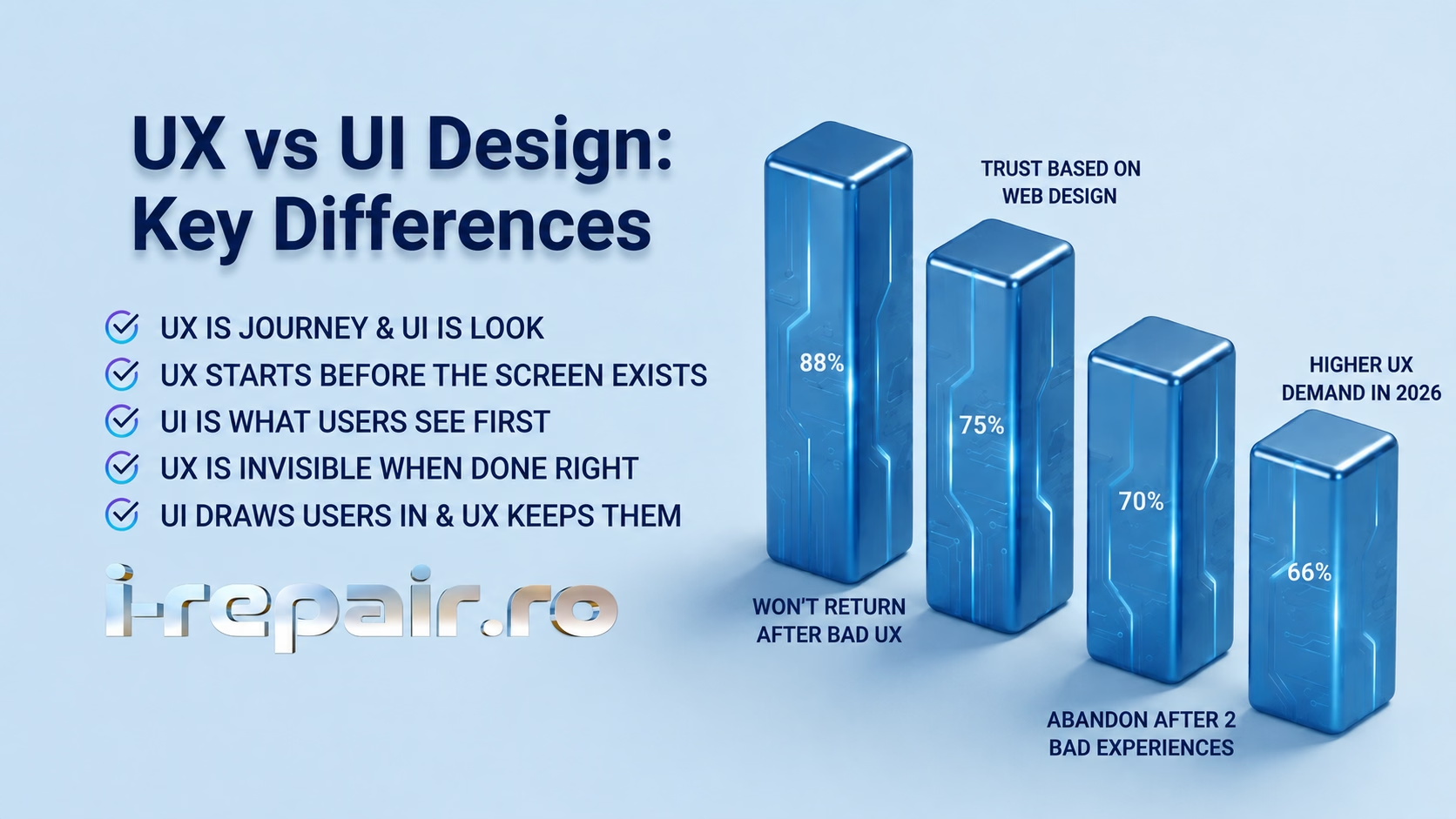
88% of users won't return to a site after a bad experience — and the UX vs UI difference is where it starts. i-repair.ro explains what each really means for your website.
If a client asked you right now, in plain English, what's the difference between UX and UI design, what would you tell them?
Think of an architect designing a new home. He knows where the kitchen is, where the living room is, and where the bathroom is. That's UX. It's the structure, the logic and the decisions about how everything fits together for that particular client and situation. Now, once the house is built and set in stone, it's time to paint, choose the furniture and do the decoration. That's UI. That's how it looks once the structure is ready.
UX is how it works. UI is how it looks. An ugly old car that functions is preferable to a beautiful one that is inaccessible.
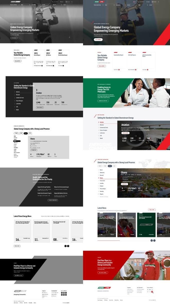
UX vs UI: Example of Side-by-side comparison of Puma Energy's UX wireframes and final UI
You've been in this industry for 20-plus years now. What's the most common mistake you've seen clients make when they confuse UX with UI or treat them as the same thing?
The biggest one is when a client requests a design because they believe it looks appealing to them. Then it ships to real users and they figure out it doesn't work. They graded the paint job and missed that the engine was missing from the car.
| The Wrong Approach | The Right Approach |
| Design chosen because it looks good to the client | Design built around how users actually behave |
| UI decisions made before UX is understood | UX research completed before any visual work begins |
| "Make it look like our competitor's site" | "Let's understand what makes your users convert" |
| Copying competitor features directly | Standing out with purpose-built functionality |
| Looks polished in the demo | Performs and retains in production |
| Personal preference drives direction | User data and testing drive direction |
Do you see clients looking at competitors and just saying, "Give me that"?
One hundred percent. "My competitor has this feature, so I should have it too." If your competitor has something, it doesn't mean you should have it the same way. You should stand out, not copy. What happens in practice is that clients make UI decisions based on what they see elsewhere and that ends up guiding the whole project in the wrong direction. The hardest part is guiding them to the right decision while making them feel genuinely heard. That's where experience really matters.
"They graded the paint job and missed that the engine was missing from the car."
Can you walk us through how UX and UI actually work on a real project? What does each phase look like in practice?
I have a perfect example. We built a help center for Douglas Boutique. They're a large Greek platform that provides the top cloth brands accessories. They already had a customer service platform, but just by looking at it you could see the UI wasn't working. There was too much text and no hierarchy. Users didn't know where to focus.
It was outdated. So, what was your first step? Did you jump straight to redesign?
Not at all. We started by understanding how the platform worked and what the goal was. There's no way you can suggest improvements if you don't know exactly how it currently works and what the goal is. Without those two answers, you're just guessing. So, we ran multiple calls with the client, mapped all the user flows and planned every possible navigation path. Then we condensed the features, reduced the number of clicks and moved into the wireframe phase.
So, the visual design came after all of that?
Exactly. Since we'd already designed Douglas' brand and their current site, we went straight to colored wireframes that reflected their visual system. Once we got those approved, we built interactive prototypes with every screen linked, so you could navigate through the mockup just like a real user would. The whole point of prototypes is to identify gaps before they become live problems. Douglas ran internal testing with multiple teams, and we caught and fixed issues that wouldn't have been obvious from a static design. The result was a clean, structured e-shop where users can actually find what they're looking for.
Everyone's talking about AI. From your perspective as a design team leader, how are you using AI in UX and UI work in 2026? What's helping and what's still getting in the way?
We use AI as a tool. We use it for research, for inspiration, and to explore new ideas. AI is not meant to do our work for us because the goal is to assist us and it is too unreliable to be fully trusted on its own. We treat every project here as unique and it must meet both our standards and the client's standards. AI can't guarantee that.
But has it changed the speed of things?
Definitely. AI made two jobs blur together. One person can now go from idea to finished screen fast, but it also made the real difference between UX and UI clearer. AI can make something look good in seconds. It still can't tell you if you're building the right thing for your business or if it'll work for your users. The visual layer is getting easier to produce. The thinking behind it, the UX, is what really matters.
That's not how it works, and I want to make that clear because I see it everywhere. Yes, AI speeds things up, but it doesn't replace the need for an expert team that can communicate with clients, make decisions and test those decisions to see if they land. People always make final decisions.
How naive can people be? Let's be real for a second. If someone offers you a "website in 10 minutes" or a "free site for my portfolio," they are either lying to you, or they are lying to themselves. Here is the hard truth: You can build a digital business card in 10 minutes. You can spin up a template, slap a logo on it, and hit publish. But that is NOT a website — that is a digital placeholder. A real website is a business asset. It is a sales funnel, a user experience, and a conversion machine. You cannot build a machine in 10 minutes. You cannot build trust, brand strategy, or a user journey in 10 minutes. You cannot test load speeds, optimize for mobile, or figure out why your "free" contact form is going to spam in 10 minutes. And the "free portfolio" builder? That is the most expensive trap in the industry. Here is what actually happens: 1. They build it for free using a page-builder they are learning on the job. 2. They disappear because they got a paying client. 3. You are left with a slow, unoptimized mess that you don't own, can't edit, and have to pay a real developer double to untangle. How naive can people be? Naive enough to think that a plumber who fixes a pipe in 10 minutes is doing a good job, rather than just slapping duct tape on a leak. They confuse speed with value. They think a website is a cost, rather than an investment. A 10-minute site gets you 10-minute results — which is to say, zero results. If you want a site that actually makes you money, brings in leads, or tells your story properly, stop looking for a microwave meal. Start looking for a chef. It takes time, it costs money, and it is worth every single penny. Don't let the hype fool you into wasting your time.
Most websites lose visitors in the first few seconds because the design doesn't make the next step obvious. Confusing navigation, cluttered layouts, and unclear calls-to-action push people away before they ever reach your offer. We build interfaces based on how users behave using research, usability testing and clear visual hierarchy to guide visitors toward the desired action. As a Web Design agency, our solutions include:
Contact us you will not regret it!